Monday, February 28, 2011

Chevy Cruz 2011

The small car segment has often taken the brunt of our low scores,  partly because the purpose for small cars is to offer affordable transportation (which for some reason has always gone hand and hand with boring).  I also believe the lack of any good design is because their target audience doesn't really care what the car they drive looks like, At Car Grade these people are known as the "evil ones".


The 2011 Chevy Cruze unfortunately did not veer from affordable boring transportation.  From the front the Cruze looks like the rest of the fleet.  The Cruze wears the signature bar across the grill, and from there everything is very predictable.  The head lights move across the front of the vehicle and then plunge rearward coming to a vampire like point near the top of the front quarter panel.  There is no unique light styling with the head lights as a whole, very utilitarian.  The Cruze does sit well on its chassis and gives off an average over all visual.  The side panels are plain and no thrills, which would be good if the car had some flair somewhere else.  I concede that it is hard to put any real lines on a compact car just because of their nature, their short, but I won't give up hope that it can be done.

The back of the Cruze is already old in our eyes.  The bar across the back is predictable and stands out because it doesn't match anything around it.  On each end of the bar are oddly shaped tail light casings that are complicated by perfectly round tail lights.  The two features don't work together at all.  I'm not sure if this was an attempt at brand recognition, because the Cobalt (which the Cruze replaces) had the similar odd shape with a perfectly round light pattern. 


 There are a couple design features that stand out enough to talk about.  First is the "triplicate rear window".  So you have the rear passenger window, next you have a smaller window that has tinting that seems irregular.  If I had to guess I think the tinting is that way to make your eye believe the window ends there, weird.  Then you have a solid black plastic piece that carries us to the end, very messy and strange. 

The other feature about the Cruze's design that we didn't like is near the front wheel well.  One (yes there are two!) of the horizontal lines starts at the top of the fog light casing and rounds over the wheel well, yikes, horizontal lines should be for the most part horizontal!  The line then comes up and ends under the side mirrors. Then another line starts near where this one ends but lower, which then travels the length of the vehicle and ends well, however two lines makes a short car seem even shorter.  

Well, hate to say it but the "Evil Ones" win again!

2011 Chevy Cruze
Grade : 5

Saturday, February 26, 2011

Kia Optima 2011


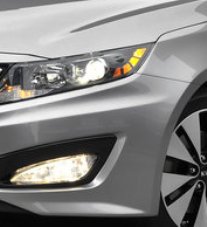
"You've come along way baby".  Kia has made huge strides when it comes to exterior design of their fleet.  In the past we couldn't wait for the next Kia to come out so we could just rip it apart.  I am sad (and glad) to say those days are gone. The Optima has grown in size and is a realistic contender in its class.  The Optima's horizontal line is strong and carries the full length of the vehicle.  Always a plus in our book.  Kia's new grill reminds me of a paper clip and doesn't really help the Optima's attempt to have a more aggressive look.  The head lights fit the design but don't evoke a sense of aggression that the rest of the car pulls off.  I really like the lighting effect located near the rear of the head light.  It gives the car some unique light styling. 


The one area that I don't care for on the Optima is the area near the bottom of the front end.  The lower air intake spans the front of the vehicle and from there black pieces of plastic encompass the fog lights making it look like one giant connected void.  This design feature just doesn't fit in with the rest of the car.  It really catches your eye which takes your attention away from the design as a whole.   


The rear of the Optima is clean and well designed.  The tail lights are slightly slanted downward as they travel around the back toward the center of the car.  The tail lights look as if they were cut off by an indentation located in the center of the trunk lid,  adding some design interest.  When the break lights are lit up they travel around the exterior of the tail light pattern giving off a nice wrap around feel.  The rear of the Optima is stylish and has a very upscale look, not enough to save the front however. All and all this is a step in the right direction for the Optima. 


2011 Kia Optima 
Grade: 8

Thursday, February 24, 2011

Ford Explorer 2011


Ford has been on quite a ride the past few years.  They seem to be on a good design run as of late, and the 2011 Ford Explorer is no exception.  The Explorer has never really fared too well at Car Grade but I think the tide is turning.  The Explorer's design seems well thought out and presents well.  It has clean lines, but still brings a little style to the table.  It's not often you can match head light design with tail light design with any level of success, Ford pulled this off perfectly when it comes to the Explorer.  It also works well with the rest of the fleet, the Edge and F-150 follow the same drop down head light look.   


The Explores has good chassis to frame ratio, and the stance is very balanced.  In the past Explorers always looked over loaded in the back, as if you were carrying everything you owned everywhere, all has been corrected with this model.  Ford has also tackled the trim around wheel wells and the lower part of the truck, it is much more subtle and works well to keep the Explorer design clean. 

I have never been a big fan of breaking a vehicles lines from front to back.  What I mean by this is if you look close you will notice that the frame that connects the windshield to the front side windows is blacked, and the same occurs in the rear.  I believe this breaks up the horizontal flow of a design.  It seems to work with the Explorer but this design feature makes it appear as if the windshield and rear window wrap around to the side of the truck.  On the previous version Ford only did this on the rear of the truck, now that they have done it to both ends it does balance out the design. 


2011 Ford Explorer

2010 Ford Explorer
The 2011 Explorer is a tight package.  From the front to the back the Explorer's lines are solid and give off an appearance of forward movement, this change alone has advanced the Explorer's design.  You notice this when you look at the 2010 version compaired to the 2011 redesign.  Notice the angle of the rear passenger window and the angle of the rear window, they are now angled forward adding a nice forward moving appearance.  With the 2011 Explorer, Ford was able to achieve a tough combination, SUV gruff and pavement pounding style.  Well Done!

2011 Ford Explorer  
Grade: 10


Wednesday, February 23, 2011

Honda Odyssey 2011


This is a very hard critic for me, I am not a big fan of the minivan or Honda as far as design is concerned. I find all Honda's, for the most part, very boring and uninspiring. The 2011 Odyssey definitely is not boring, however it is not pleasant to look at either. The most striking design feature of the Odyssey is the goofy window drop near the rear of the van. In that same area it looks like Honda had two different design teams work on the Odyssey and couldn't decide which one they liked so they cut the designs in half and glued them together.  I believe that a good car design moves horizontal from the front to the back. Anytime designers add vertical movement into their designs it breaks up the flow and causes awkward lines.  The Odyssey definitely got hit by the ugly stick!
                                        

The overall look of the 2011 Odyssey is a departure from previous versions. The Odyssey's of the past were very chiseled and had cleaner lines. This Odyssey has some curves to it but the pieces just don't match up.
The front of the Odyssey is very weak and looks like it received some design influences from the Honda Fit, and the tail lights of the Odyssey look like a very sad, droopy robot.  The Odyssey has a good stance but is disrupted as you move from the rear sliding door past the rear wheel.  The trim that is under the side doors does not continue to the rear of the van, which reinforces the notion that two designs were forced together.  We will have to wait and see if the Odyssey's design is a glimpse of where Honda is heading in the future, I am hoping its not.


2011 Honda Odyssey
Grade: 3


Welcome to Car Grade's New Blog

Welcome!  Here at Car Grade we are critiquing mans greatest invention, “the automobile”.  We are only evaluating the exterior of a vehicle, because looks matter!  We will give each vehicle we look at a grade, 10 being the highest.  We will be looking at the lines of the car, brand cohesion, stance, and all around appearance.  We will also issue a grade for restyled vehicles.  Many car companies change minor elements of a vehicle and market it as totally redesigned.  We are not fooled and those vehicles will not be evaluated again.  Enjoy!
Car Grade Team